The trend has become more prominent since mobile devices now contribute to more than 60% of web traffic. This has led businesses not to design their websites with the desktop first, but instead mobile-first, which ensures a smooth experience on smartphones and tablets before adapting for larger screens.
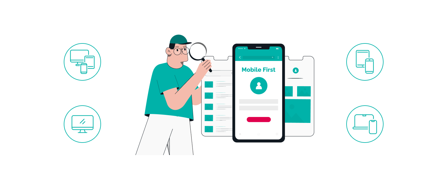
What is Mobile-First Design?
Mobile-first design is an approach where web development starts with the smallest screens (mobile devices) and then scales up to larger devices like tablets and desktops.
Why Mobile-First Design Matters?
- A better user experience– Mobile-friendly sites are easier to navigate and provide a smoother user experience.
- Improved SEO – Google favors mobile-friendly websites in search rankings.
Faster Load Times – A mobile-first approach encourages optimization, removing unnecessary elements that slow down a website. - Increased Conversion Rates – Mobile-optimized websites improve customer retention and drive higher engagement.
- Future Proofing – The businesses that continually take mobile first strategies will keep abreast of their competition.
Best Practices for Mobile-First Design
- Responsive design ensures that the website is rendered uniformly across all devices.
Optimize images and content for a quicker load speed. - Navigation should be touch-friendly with easy-to-tap buttons.
- Use minimalistic layouts to remove clutter.
- Test across multiple devices to ensure compatibility.
Mobile-first design is no longer optional—it’s a necessity. Businesses that prioritize mobile-friendly experiences will have better engagement, higher rankings, and increased conversions.